Overview
MoneyPrep is an e-learning platform and it aims to provide financial literacy to 5-12-year-old kids through its interactive approach to learning.
My Role: UX/UI Designer
Duration: 6 months
Team: 1 Designer (myself), 3 Developers
Tools used: Adobe XD, Zeplin, Photoshop, Illustrator
To comply with the non-disclosure agreement, I have changed some of the quantitative data and omitted some information in this case study. All information in this case study is my own and does not necessarily reflect the views of MoneyPrep.
Challenge
Teachers were not using MoneyPrep account very often after they downloaded the free resources provided by MoneyPrep for their students. This reduced their chances of creating student IDs for their students. This also reduced the chances of kids asking their parents to buy premium membership to play MoneyPrep premium games.
Goals
User: Teachers account should be easier to use and valuable for them to continuously use it
Business: Increase engagement and retention rate
What I did
1) Refined the user flow of teacher's account
2) Created consistent user interface throughout the app
3) Redesigned the existing features (dashboard, teacher resources)
4) Designed new features (Manage Class: Student IDs)
Results: Teachers engagement and retention rate significantly increase
Process
Finding the Problem
I conducted usability testing with 10 users and I found out that majority of the users found it difficult to navigate through the teacher's account.
SOLVING THE PROBLEM
Design Goals
1) Refine the user flow of the teacher's account to make it easy to navigate.
2) Enhance user interface design to make the app visually attractive.
3) Designing additional features to support teachers in managing their class.
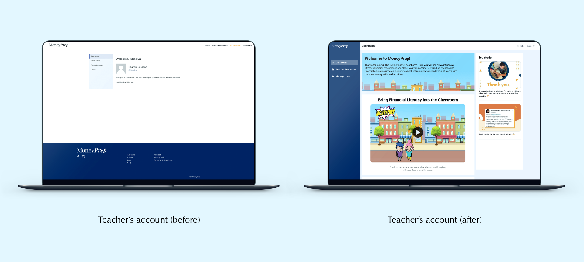
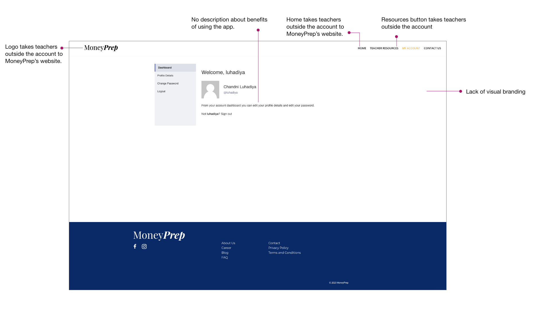
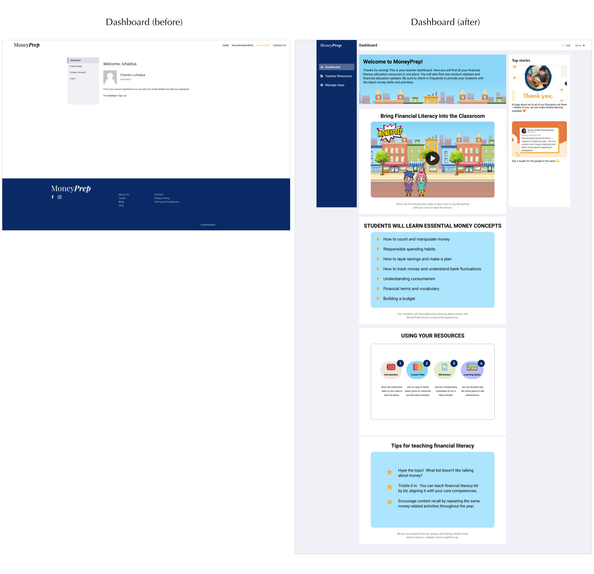
Dashboard design: Before
In the initial version, I noted down some of the major areas which needs redesigning, to increase usability.
Redesign explorations: Dashboard
After brainstorming the dashboard designs, discussing with founders and developers, I came up with the following dashboard design options.
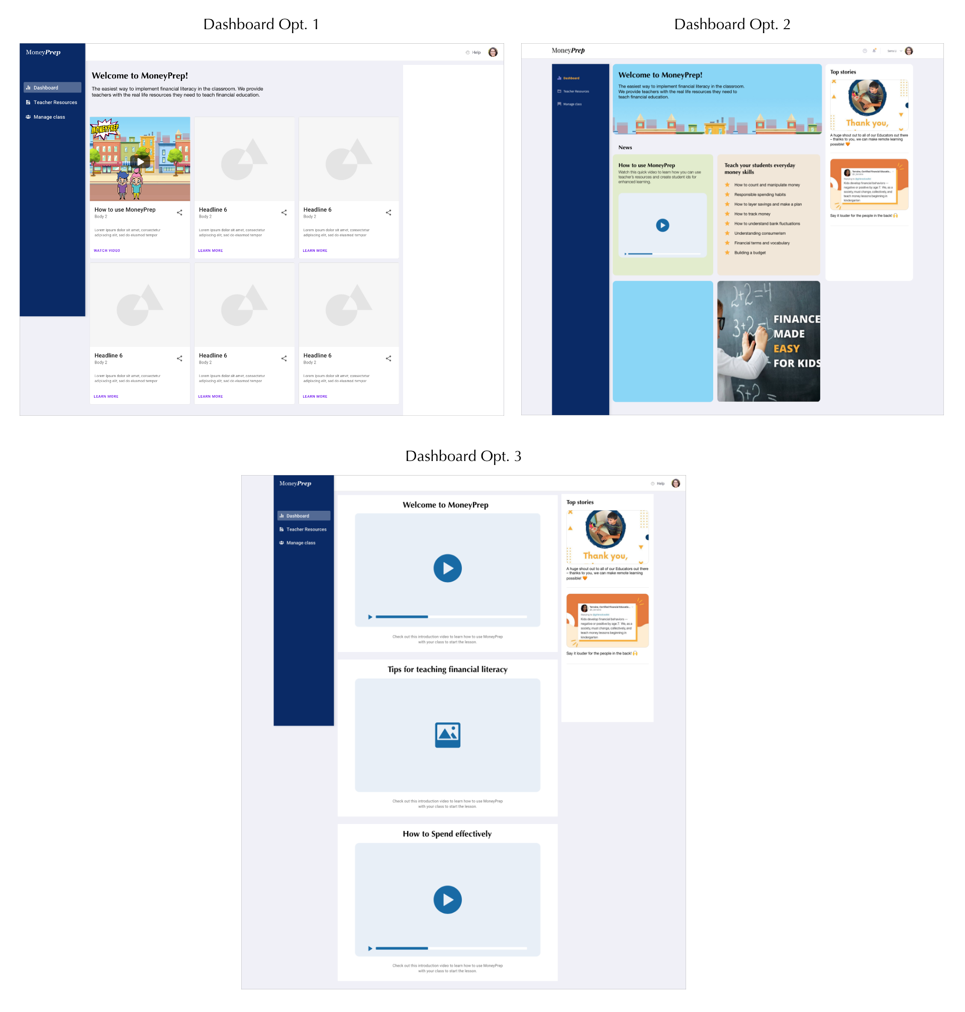
Option 1
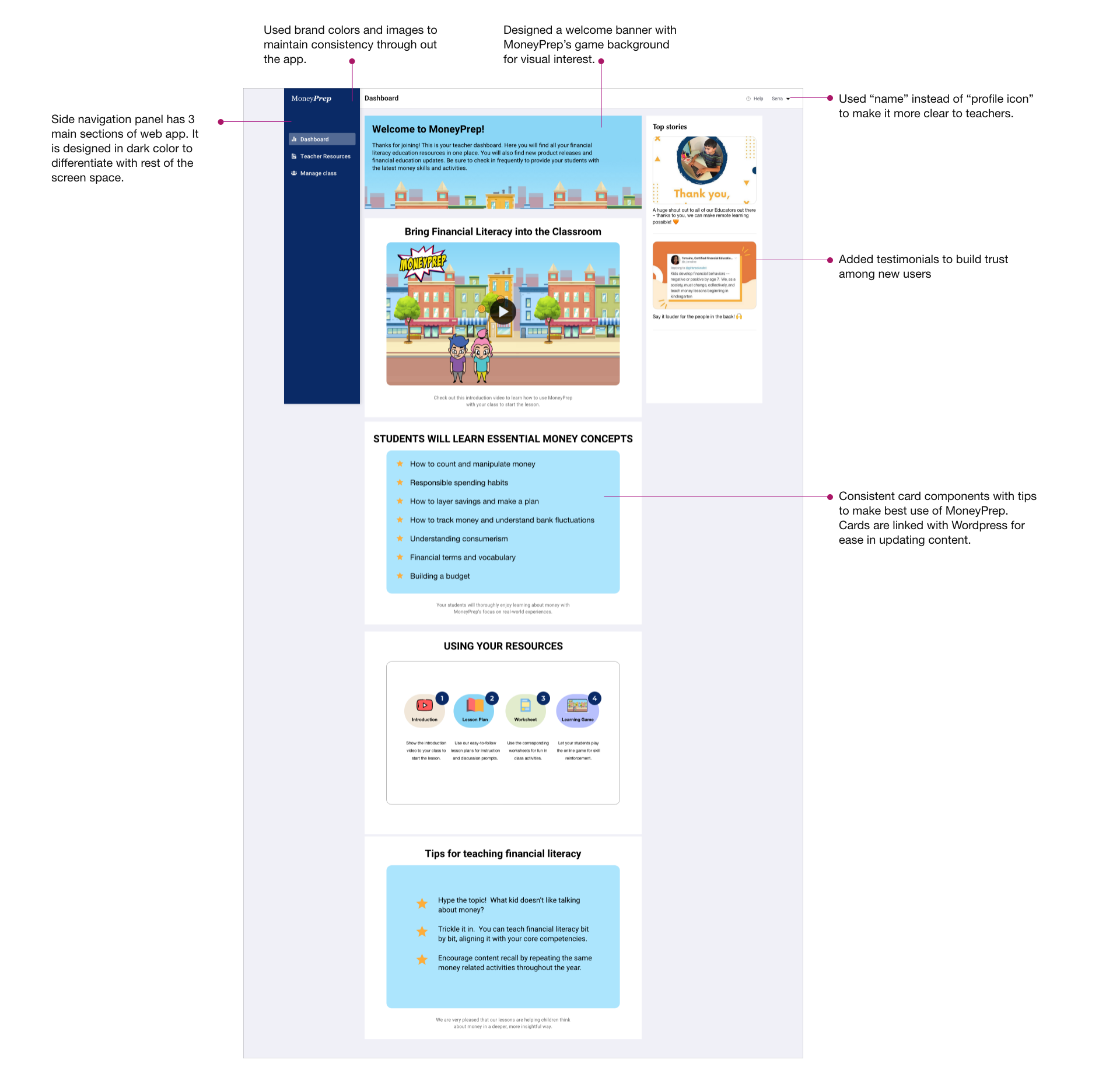
I decided to make the side navigation bar in dark color to differentiate it with the rest of the app space. I divided the app into 3 main sections: Dashboard, Teacher's resources and Manage Class. All the profile settings can go in the user profile section which will open once user clicks on their profile icon. The centre section will welcome teachers with a brief description of benefits of using MoneyPrep. Below that, they will see cards describing how to use money prep, tips and tricks to make the best use of it for students. On the right side, there will be testimonials to build trust among users and other announcements such as feature update or promotions.
Option 2
After discussing the designs with the developers and other team members, we decided that it would be best to provide all the information on the cards itself as we currently do not have a lot of information to be provided in "Learn more" button. Also, it will keep the users on the app itself. Therefore, I designed cards which would incorporate all the information in the form of videos and text.
Option 3
I discussed option 2 with the team, and we decided to make standard cards or components, so that developers can connect that to Wordpress. In this way, anyone in the team will be able to update the content as per the requirements without depending on developers to update the content. Therefore, I created the standard card components, and as we have limited content, I increased the size of each card so that users can view it even without full screen mode.
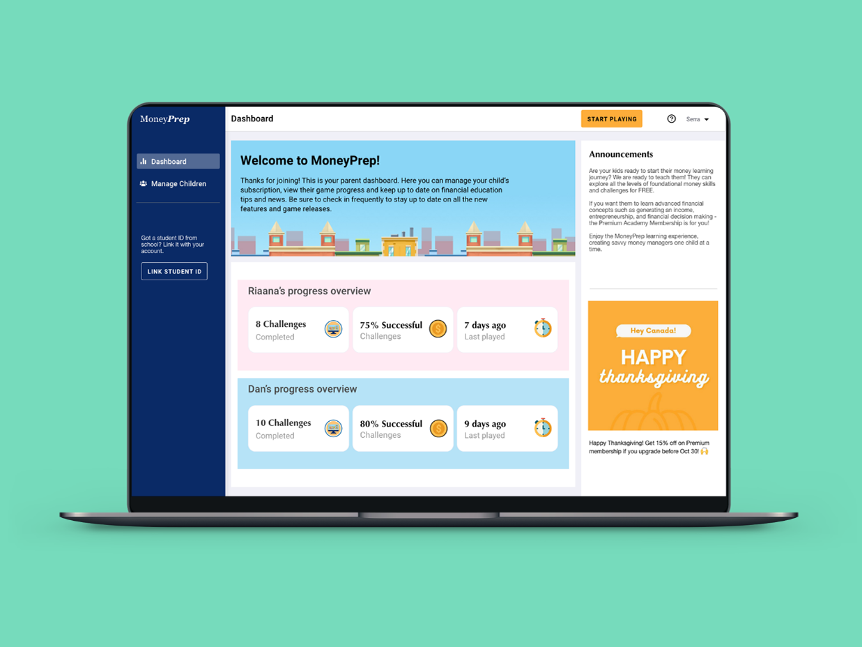
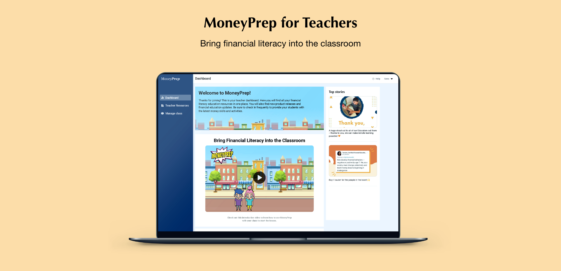
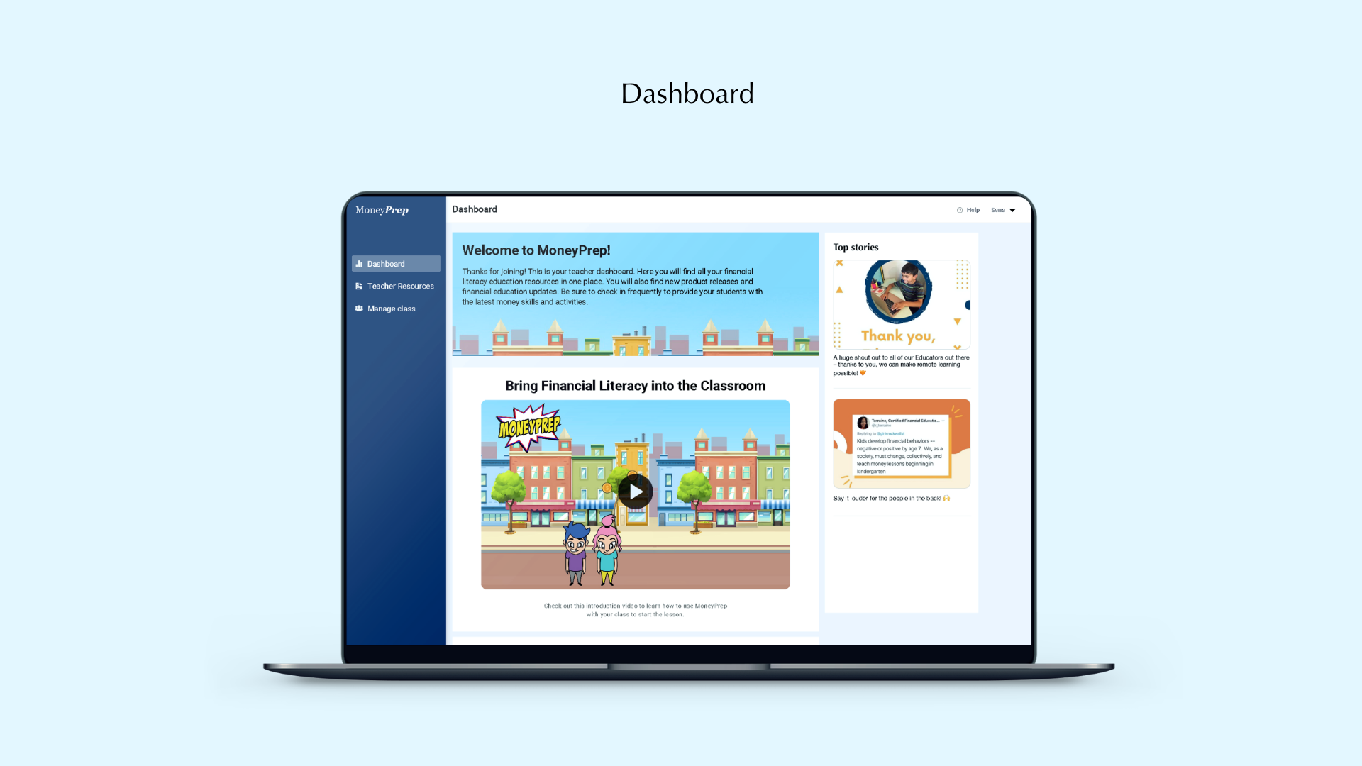
New Design: Dashboard
Option 3 was selected and below is the high-fidelity version of it which got developed.
Design comparison
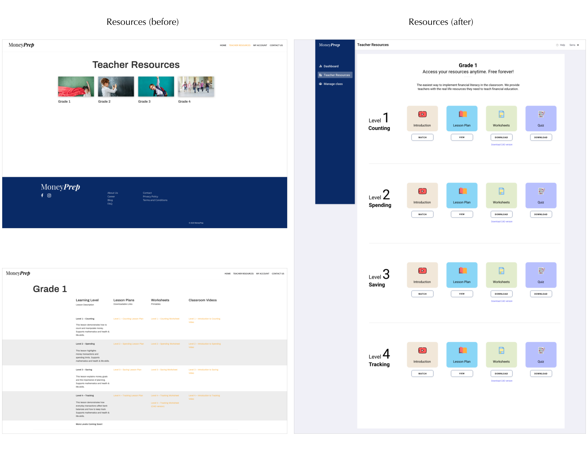
Redesign Process: Resources section
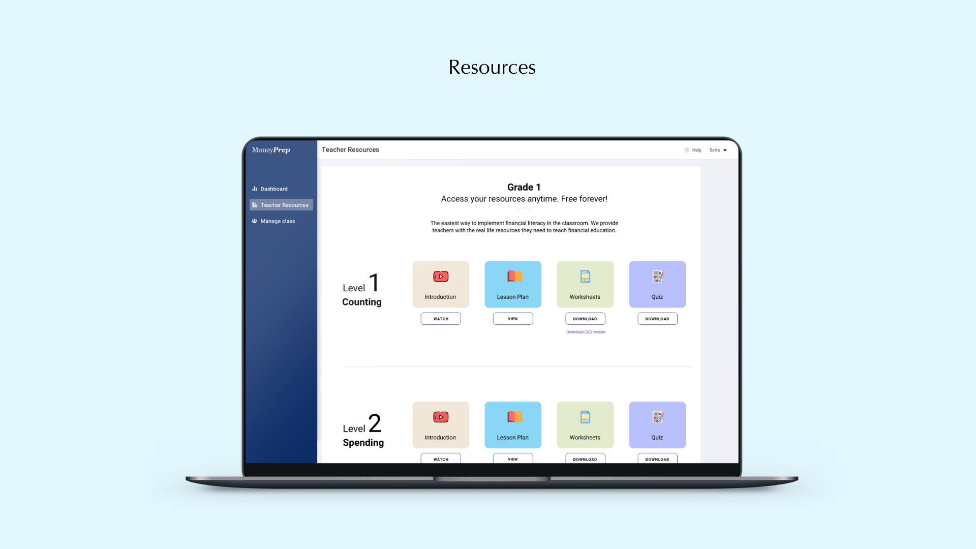
MoneyPrep provides teachers some resources such as worksheets, quizzes, and lesson plans to help them teach money lessons to their students. The initial teachers resources button was taking the teachers away from their account to a separate screen. This was creating confusion among teaches. As this is the most important feature, I decided to keep it on the side navigation panel.
Also, earlier, teachers were able to see resources from all the grades. However, after discussing with the team, we decided to show only the grade which the teacher signed up for. If the teacher wants to see other resources, they will have to sign up again with a new email address.
The resource section was lacking visuals. I decided to add some visuals by incorporating colors and icons.
Design comparison
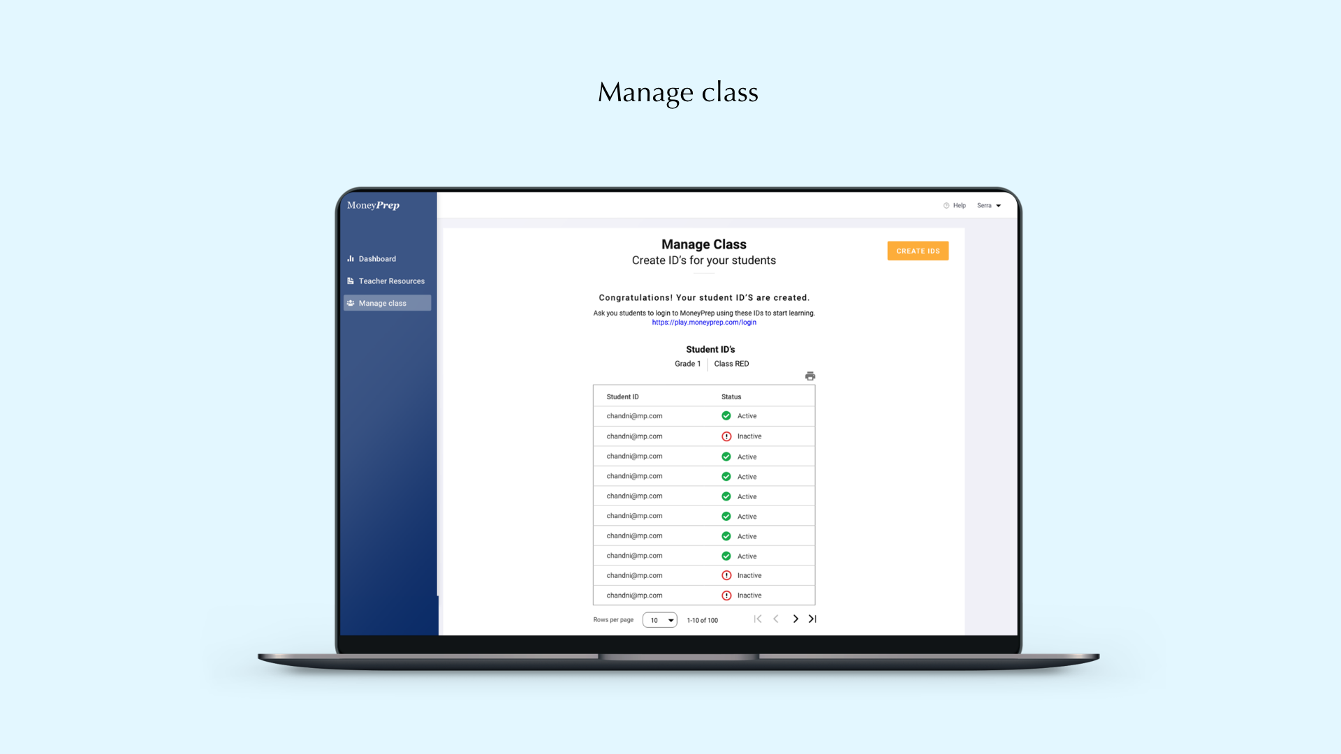
New feature design explorations: Manage Class
To allow teachers to enhance financial literacy of their students, we brainstormed few features. For this version, we decided to keep a feature which can allow teachers to give student IDs to their students. Using these student IDs, students can log into the MoneyPrep game to learn more money lessons. If students like to play advance levels, they can ask their parents to upgrade for premium membership. Parent's also get the option to link the student IDs their kids have received from teachers with their own account. In this way, parents can keep a track of their kids progress.
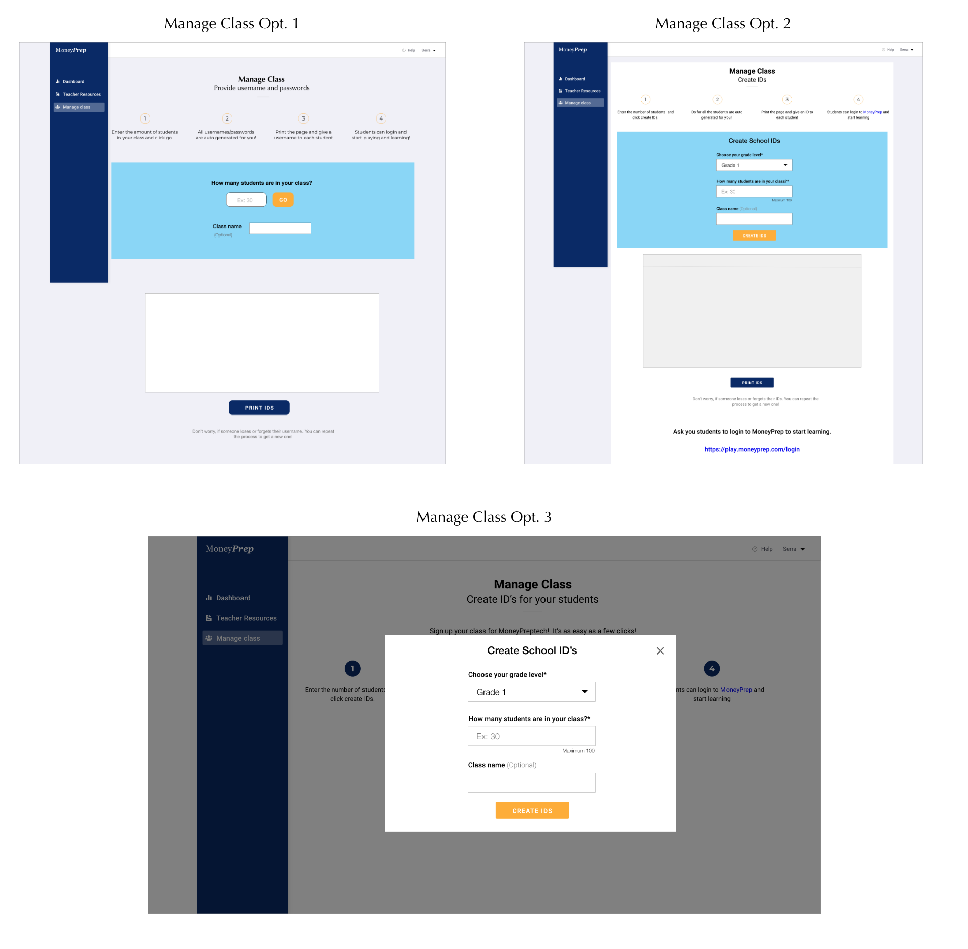
Option 1 and Option 2
In the first 2 options, I kept both the instructions to create Student IDs and the ID generator on the directly in the space itself. Once the IDs are generated, the teacher can get the option to print these IDs and hand it off to students. Students can use these IDs to login to MoneyPrep game.
Option 3
After discussing the designs with developers, I received the feedback that it would be better to have fields for generating IDs in a dialogue box once teacher's click on "Create IDs" button. This will minimize screen space, and will also allow teachers to focus on their generated IDs. If they wish to create more IDs, they can click on "Create IDs" button.
New Design: Manage Class
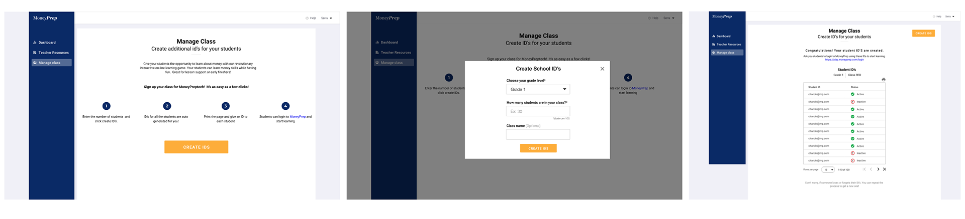
New Designs
Here are the final designs of the three major sections of the teacher's account I designed at MoneyPrep. These designs of teacher's account was developed and launched in November 2020.
TESTING
RESULTS: The teacher's engagement and retention rate on the platform significantly increased after we released this version.
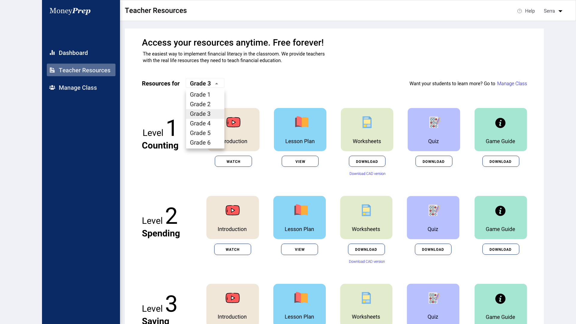
After the release, we received demand for providing resources for multiple grades at a time. Initially, we gave them the option to only receive resources for the grade level they signed up for. However, as many teachers were teaching multiple grades together, they wanted to use these resources for several grades.
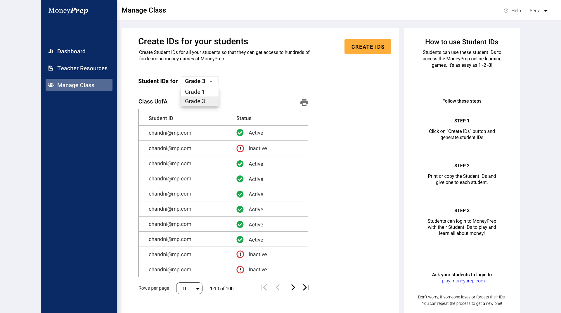
Here is the new design we released for multiple giving access to multiple grades.
I also provided step by step information on how teachers can use student IDs to help their kids learn more about money.
This version got released in January 2021. We are still gathering data on teacher's account retention rate.
Next steps
Coming up next, I plan to run another usability test to measure task completion rate. The goal is to enhance teacher's experience with using their account, increase student IDs creation and help kids learn advanced money management skills using MoneyPrep.